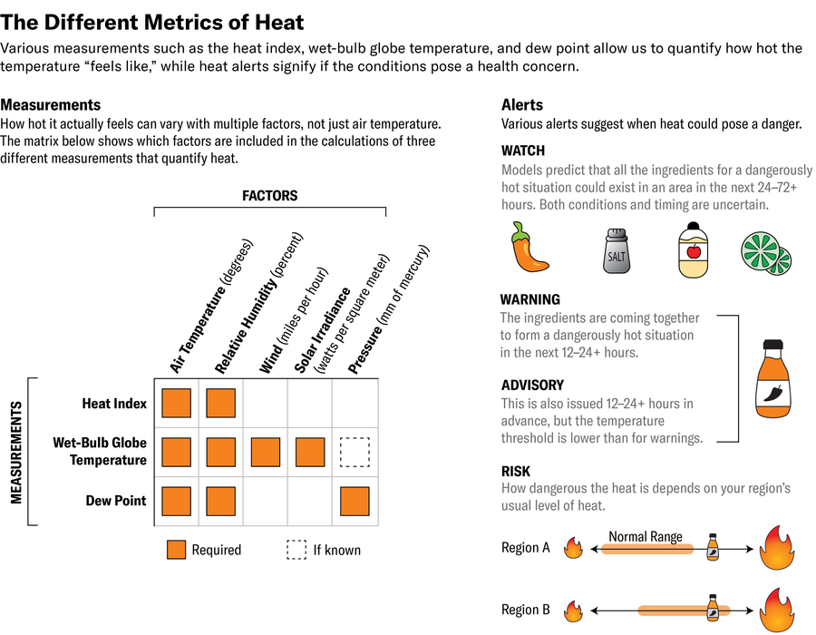
The summer sun is rising in the sky as you’re getting ready for the day. You check the forecast to see how hot it will be: The high is 94 degrees Fahrenheit (34 degrees Celsius). The heat index is 102 degrees F (39 degrees C). The relative humidity is going to be 50 percent in the afternoon. There’s a heat advisory in your area, and the “heat risk” is orange. Clearly, it’s going to be a warm, muggy day. But what exactly does this jumble of numbers and terms actually mean for what you’ll experience outside and what precautions you should take?
“It can be confusing, having multiple parameters or indicators of heat and heat stress,” says Kimberly G. McMahon, public weather services program manager at the National Weather Service (NWS) and co-lead at the National Integrated Heat Health Information System.
Scientific American is here to help unpack the various measures and tools used to communicate heat and its associated risk to help you prepare for the day.
On supporting science journalism
If you’re enjoying this article, consider supporting our award-winning journalism by subscribing. By purchasing a subscription you are helping to ensure the future of impactful stories about the discoveries and ideas shaping our world today.
Temperature
When you’re talking about a heat event, the baseline measurement is air temperature.
The NWS has a series of stations that measure the temperature of the air a few feet off the ground. Of course, temperature can vary widely over even a small area, so the reported figure for, say, New York City may not be the same across the entire metropolitan area. The verdant expanse of Central Park is generally a few degrees Fahrenheit cooler in the summer than a neighborhood with plenty of paved surfaces and little green space.
And our experience of temperature varies depending on whether we’re in the shade or the sun: standing in direct sunlight can feel 10 to 15 degrees F (six to eight degrees C) hotter to the body than the measured air temperature.
High temperatures can place a lot of stress on one’s body, especially for young children, older people, those with certain health conditions or on certain medications and those who don’t have ready access to air-conditioning. “No one is immune from the effects of heat, but there are some who are more susceptible,” McMahon says. “It’s a really personalized hazard.”
When the human body overheats, it can become dehydrated, which causes the blood to thicken and the heart to work harder to pump. Heat exposure can lead to heat exhaustion, which can feature nausea, dizziness and muscle cramps. Exposure can also lead to heat stroke and even death.
And though we’re all familiar with how the temperature feels according to whatever scale we use (Fahrenheit in the U.S.; Celsius nearly everywhere else), this figure isn’t always the only factor in summer heat. There’s another measure that plays a big role in how we experience heat, especially when it’s extreme.
Humidity
Most of us are broadly familiar with humidity—the amount of water vapor in the air—and how it can make a hot day much less pleasant and sweatier. But though we know a humid day feels worse, not everyone makes the connection “that an 85-degree-F [29-degree-C] day that is very humid is worse on your body than an 85-degree day that is dry,” says Casey Ivanovich, a Ph.D. student who studies extreme heat at Columbia University.
Humid heat can be more of a health risk because the more moisture there is in the air, the less the body can naturally cool itself off through the evaporation of sweat. So humidity is a key component to consider when thinking about your experience with the day’s weather.
Relative humidity
Forecasts typically communicate this experience through relative humidity, which expresses the amount of water vapor in the air relative to what the air could hold at a given temperature. That means relative humidity is, as its name suggests, relative to the temperature, which can make it difficult to gauge how muggy conditions will feel. An 80-degree-F (27-degree-C) day with 50 percent humidity feels a lot more humid than a 30-degree-F (minus-one-degree-C) day with 100 percent humidity, for example.
Relative humidity can also change during the day: the humidity can be, say, 90 percent in the morning and 50 percent in the afternoon, when the temperature is higher, and yet conditions won’t feel any less humid later in the day.
Dew point
For this reason, a lot of meteorologists and weather enthusiasts prefer to use another measure, the dew point. The dew point is the temperature the air would have to be cooled to for the water vapor in the atmosphere to start condensing out, meaning the air would reach 100 percent relative humidity. The nice thing about the dew point is that it doesn’t change with the temperature, though it can change during the day if a moisture-laden air mass moves in or out of the area.
But you don’t have to remember that definition to use the dew point to gauge how humid it is outside: using a rough guideline, a dew point below 55 degrees F (13 degrees C) is dry and pleasant; between 55 and 65 degrees F (18 degrees C), it’s starting to get sticky; and above 65 degrees F, it can start to feel like you’re swimming through the air. Once you get into the 70s F (low to mid-20s C), it’s oppressive.
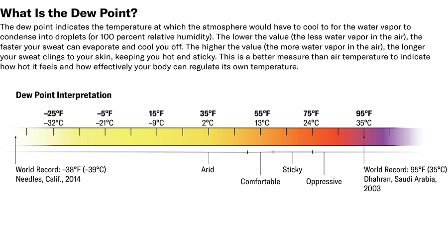
But how comfortable you are at a given dew point depends on how acclimated you are to humidity. For much of the western U.S., the air is generally pretty dry, and dew points are low, so even those middle dew points can feel uncomfortable. Along the Gulf Coast, humidity is the norm, and dew points are routinely in the 60s F or higher. “Everybody has their own threshold,” says Jared Rennie, a National Oceanic and Atmospheric Administration research meteorologist. (For his part, Rennie jokingly uses “the Jared is miserable index,” where anything above a dew point of 55 degrees F is miserable. “It is backed by zero science,” he says.)
Not everyone has that level of interest in the weather or that much time on their hands to dive into dew point, so there are some other tools that can be used to get a sense of what it’s going to feel like outside.
Heat index
One tool the NWS has used for a few decades is called the heat index, which indicates how hot it feels. More technically, the index brings temperature and humidity together to give a sense of how hot the weather will feel to the body.
The heat index is calculated with a complex equation that factors in relative humidity and air temperature. So, for example, if it’s 84 degrees F (29 degrees C) and 75 percent relative humidity, it will feel like 92 degrees F (33 degrees C). But that equation makes various assumptions about a person’s age, height and weight, and it also assumes they are at rest in the shade. For people who are older, engaging in strenuous activity or located in direct sunlight, the heat index will be higher. Conversely, if there’s a breeze, they can feel cooler.
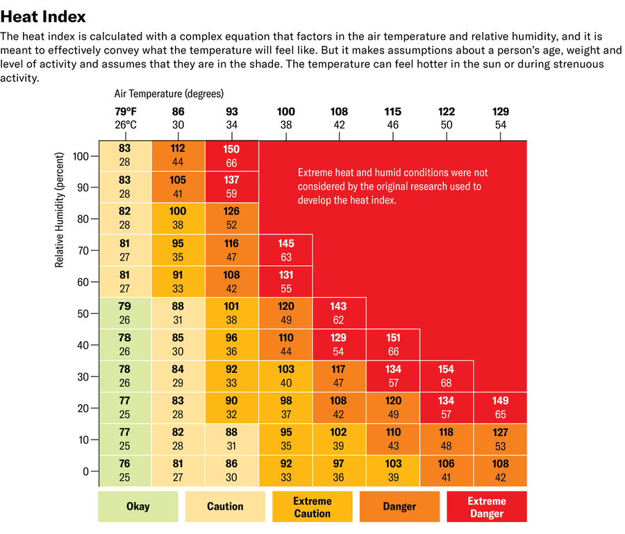
But “with any heat tool, there are strength and limitations,” McMahon says. The heat index isn’t very useful in the western U.S., where humid heat is less prevalent, and the equation was never tested for very extreme heat and humidity. The NWS has attempted to adjust for those extremes, which are occurring more often as the climate warms. A 2022 study in Environmental Research Letters, however, suggests that the agency’s method of adjustment is underestimating the heat index in those extremes and suggests an alternate approach.
Even with these limitations, though, McMahon says the heat index is a useful way to quickly get across to the public that it will feel hotter than the actual temperature.
New Measures
The NWS and other experts are working on different, more actionable ways to better convey to people the health risk that comes with heat. Doing so is crucial because heat waves are now more frequent, more intense and longer-lasting.
Wet-bulb globe temperature
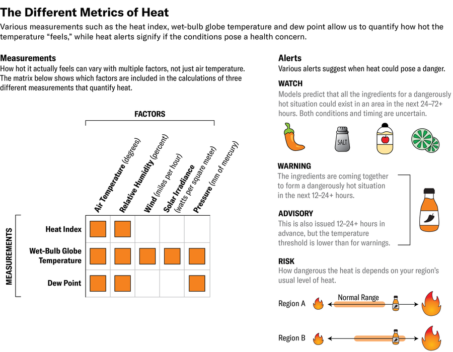
One such measure is pretty wonky, and its name is a mouthful: the wet-bulb globe temperature. It accounts for not only the air temperature and humidity but also sun exposure and wind speed. The U.S. military developed the measure in the 1950s “to address the high amounts of heat illness they were seeing in their training camps,” McMahon says. School districts and sports teams are starting to use it more to decide whether to hold summer practices. In Florida the Zachary Martin Act (named after an athlete who died from heat illness) was passed in 2020 to require high-school sports teams to use the wet-bulb globe temperature to determine if it is safe to hold practice.
The measurement tends to only be used by institutions with people trained in how to interpret it because it can yield numbers that are lower than the actual temperature. “A dangerous value is 90 degrees” F (32 degrees C), Rennie says. In those conditions, “you cannot be outside.”
Stickiness
Ivanovich and her colleagues at Columbia University are developing a measure they call “stickiness.” It effectively indicates whether a given extreme heat event is more a factor of temperature or humidity. The distinction is important because “the different types of actions that people need to take might be different” depending on which factor is weighted more heavily, she says.
She and her colleagues envision local weather and climate experts using the stickiness index to determine whether heat events in an area are consistently more temperature- or humidity-driven or if they are highly variable. In the latter case, local authorities should explicitly warn people if a given event will be very humid so they can take the appropriate precautions to stay more hydrated and cool off. “It’s encouraging that we’re seeing more and more people try to wrap humidity into extreme heat communication,” Ivanovich says. “The more aware [we are], the better.”
Heat watches, warnings and advisories
To help people know when they’re most at risk and what to do, the NWS puts out various hot weather alerts. Until recently, these came in the form of heat watches, warnings and advisories that were tied to certain temperature thresholds. Those thresholds “are very specific to where you are,” Rennie says, because what feels like extreme heat to people in Seattle is different than what feels oppressive to people in Atlanta.
As with other weather watches, a heat watch is issued when the heat index is expected to be above a certain threshold, generally in the next 24 to 72 hours, but the timing and the question of whether the extreme heat will materialize are still uncertain. Sometimes heat watches can be issued even further in advance if forecasters are fairly confident the event will happen.
Warnings and advisories are generally issued about 12 to 24 hours in advance, though they can also be issued earlier when confidence in the forecast is high. Warnings have a higher temperature threshold than advisories.
Though these alerts can be helpful in grabbing the public’s attention, they don’t always work well where major changes in topography create very different microclimates in a forecast area.
Rennie gives the example of Asheville, N.C., where he lives: the NWS office for that area has a 105-degree-F (41-degree-C) threshold to trigger a heat advisory, but the relatively milder climate up in the mountains, where Asheville is located, means that at lower temperatures, it feels much hotter to people there at than to those down in the Piedmont plateau to the east.
Heat risk
To help get around the limitations of existing tools, the NWS has developed an interactive map-based tool called HeatRisk. It’s “the first heat alert system across the CONUS [continental U.S.],” says Mike Staudenmaier, chief of the Science and Technology Infusion Division at NWS Western Region Headquarters.
The system uses a color-coded ranking of green, yellow, orange, red and magenta to denote increasing risk. Those rankings are based on the maximum and minimum temperatures for a given day in a given area by how unusual they are compared with the historical climate for that place at that time of year. So, as with watches and warnings, HeatRisk is sensitive to what people are locally acclimated to. A 90-degree-F event in New York City in April is different than one in July “because people have had time to adjust to the warmer temperatures” later in the summer, McMahon says. Similarly, a heat event that might be rated orange (moderate risk) or red along the Gulf Coast may be rated a magenta (excessive risk) farther north, where the same conditions are less common.
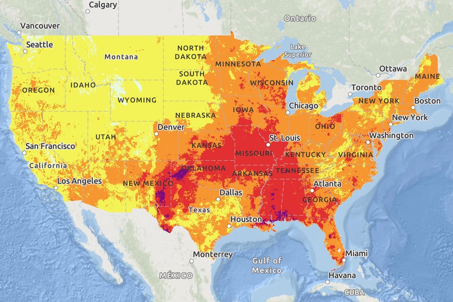
The NWS HeatRisk map for July 31, 2024.
The HeatRisk map also uses Centers for Disease Control and Prevention mortality data that link temperatures to upticks in heat-related deaths. And it factors in expected duration of the heat because that heat’s effects stack up when there’s no time for the body to recover and cool down.
The map can also be more tailored to very localized changes in climate. For example, it can show green levels on the coast of California and quickly move up to orange or red moving inland. As an example, Rennie notes a recent heat wave where his house was in the orange category, his work was in yellow and his son’s camp was in red.
HeatRisk does not factor in humidity, but it does consider overnight low temperatures, which track well with dew point, Staudenmaier says. For example, if the dew point in Atlanta is 73 degrees F (23 degrees C), the temperature will be equal to or above 73 degrees F. Through those means, the tool can account for humid heat events.
The risk levels also account for the people who are more susceptible to heat and need to take precautions at lower risk levels than others who are less susceptible. Some risk communication experts would like to see the wording around those risks change to better convey when people need to be aware because terms such as “minor” can inadvertently convey that there is little risk.
McMahon says that the tool is considered “experimental.” The NWS, which rolled the measure out to the whole continental U.S. for the first time this year, will be considering feedback and tweaking it to make sure it’s as useful as possible. The NWS is also still working on extending the tool to Alaska, Hawaii, and Puerto Rico and other U.S. territories, she says. The difficulty there is the relative dearth of historical data.
Though the HeatRisk tool isn’t perfect, “it’s a start,” Rennie says. McMahon adds that the only way we can minimize heat illness and death is through just such “a whole-of-country approach” that gives people ample warning. “We really emphasize using it to help people plan and prepare.”

